In web design, trends come and go and you learn to keep an eye out for them. The life span of popular trends can take a nosedive rather quickly with websites. Sometimes trends start to die out for good reasons.
Let’s take sliders, for example. They’ve become so ubiquitous with sites it’s hard to avoid them. If you were having a site designed, you wanted one because doesn’t everyone? It’s the thing to do.
In the last two years, I have had to talk many clients out of the idea. If you weren’t a heavy picture-producing company with a portfolio, why would you need one? They require a lot of maintenance to keep them fresh. Yes they were pretty, but were they appropriate?
Sliders Don’t Sell
I wouldn’t necessarily agree with the notion that "sliders don’t sell" since they do benefit certain people, like interior designers. Obviously they have a lot of photos to feature and the judicious use of sliders might be a good introduction. Just don’t make it the only way to view pictures; don’t overwhelm the content, and keep in mind they have usability problems (can’t use the keyboard to access, for example).
Banner Blindness
Most companies have content or offers they need to feature to entice the user to venture further into a website. Unfortunately, sliders (a.k.a. carousels) haven’t lived up to the promise of engaging users. They seemed to have developed "banner blindness."
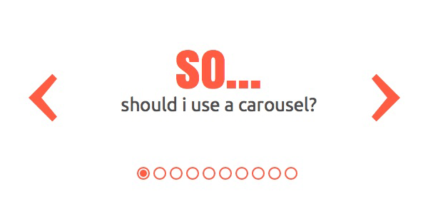
So… should I use a carousel? http://t.co/XMDra44wKr
— Jeffrey Zeldman (@zeldman) November 19, 2014
Wednesday, industry leader Jeffrey Zeldman tweeted a link about sliders from his leading web design conference "An Event Apart." The tweet shared a link to the website "Should I Use A Carousel?" produced a year ago. It was the first time I’ve seen it, but I was already aware of other articles indicating that people simply ignored them. They were used too much; it made sense that people skipped them to get to the content – you know, information we actually want and need.
Here are some quotes from "Should I Use A Carousel?"
"1% clicked a feature. Of those, 89% were the first position. 1% of clicks for the most significant object on the home page?" nd.edu stats by @erunyon
Ouch – 1% for a site that has over a million hits! Here are more:
"We have tested rotating offers many times and have found it to be a poor way of presenting home page content." Wider Funnel in "Rotating Offers, the Scourge of Home Page Design"
"Carousels are effective at being able to tell people in Marketing/Senior Management that their latest idea is on the Home Page. Use them to put content that users will ignore on your Home Page. Or, if you prefer, don’t use them. Ever." Lee Duddell
"Carousels pose accessibility issues for keyboard and screen reader users that simply cannot be adequately addressed by markup or hacks. Carousels are this decade’s <blink> tag." Jared Smith
The data has been pouring in on the ineffectiveness of sliders, which means this trend is dying. Ineffective techniques get the boot by those making websites. So for your next website – give this a pass!
FYI – a word to the wise with looking at theme sellers. Since people love the look of sliders, you’ll see them as the last bastion of website makers promoting sliders. They target the uninformed buyer who most likely doesn’t have a developer to clue them in.
What do you think of sliders? Do you notice them or simply continue scrolling to get to what you’re looking for?
Thanks for just re-enforcing what I’ve been telling my clients. Say no to sliders!
I love that, I think I’ll use that “just say no to sliders!” Thanks Carol
This is a great article. I’m relatively new to web design/development and it only took me a few client projects to realize this feature was going to become old, quickly.