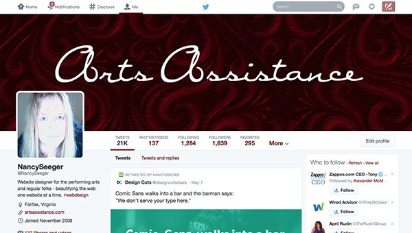
It’s Here! The New FaceBook, I Mean Twitter Layout!
If you have logged into your Twitter account recently you may have discovered you are prompted to try out the new layout. If you haven’t been prompted, you can take a peak by clicking on the "Me" menu link item and it will prompt you. No worries though, you don’t have to commit until you are ready.
But eventually it will switch you so I’m here as your web designer sidekick to give you some pointers.
What You Need To Know
Twitter is much better than the behemoth Facebook in giving you accessible information on the sizes needed for the new graphics and settings. Here is the scoop.
- Cover Image. You no longer have a background picture where you are trying to somehow (awkwardly) position information on the side for who knows what monitor people are using. That was a pipe dream. Now you have a cover image similar to Facebook. The dimensions are 1500 pixels wide by 500 pixels high.
- Profile Image. Twitter asks for a 400 pixel by 400 pixel profile picture. This is much larger than the old days of 70+ pixels, unfortunately that will look grainy. Due to retina image displays, Twitter is asking for larger pics.
- Crop Your Profile Pics. Tip, make sure it is mostly a headshot. A body shot is going to look pretty tiny on high resolution displays. For example I have a non-retina display on my monitor and I see 200 pixel square displayed but the profile picture is actually 400 pixel square. See this example I just did for a client.
- Background Image. Alas this is now gone for the new layout. If you haven’t converted your profile to the new layout your background image will still display, but not for long.
- Background Color. From what I can tell, the public isn’t going to be seeing your background color with the new layout. Your profile page now displays a Twitters color scheme for the background. However the interior pages for you does offer a color so go ahead and go wild! Access it from the settings widget icon, then pick from the left sidebar "Display."
- Theme Color. This is the color for the links. Make it a nice contrasting color that works with your cover photo/artwork. In the display settings for your profile (settings widget icon, then pick from the left sidebar "Display") you will see the option for "Theme Color."
If you aren’t sure what your website is using for colors, hop on over to Stylify.me and put in your domain URL.
Tip, don’t go too wordy on your cover image. That image is resized for the mobile devices and squinty tiny text is not going to look good when viewing in a browser. Try editing your profile description to fill in the gaps since that is now prominently displayed.
Bufferapp had a really good article about the new Twitter profile that is super helpful, highly recommend.
Okay there you go. I hope that helps you in getting ready for the big layout change. Have you changed to the new layout? Send me your URL, I would love to see it.
