We all hear that content is king. Although it certainly is important to have good copy, the king isn’t alone in the marketing tool belt. Here is another one for you – readability is the bomb!
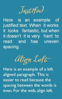
Last week I was asked about using justified text in paragraphs for websites. After all, print publications certainly do. Unfortunately, this is not a good idea and it is mostly because spacing for paragraphs is not at the level of sophistication as print programs. Although significant progress has been made for HTML browsers, we aren’t there yet. As one user experience expert put it, you will see "rivers of uneven spacing between letters and words." That would make for a challenging reading experience.
Need Some Guidelines? Here Are a Few Tips.
- Headlines. The main headline can be centered; the rest should be left aligned.
- Bulleted lists. Always align left; centered text is tough to read plus the "dot" would be spaced far away. One option is to center the entire column, just not the list itself.
- Paragraphs. Align left, but definitely do not right justify. Leave right alignment to the design gurus; it’s hard to balance that kind of orientation.
- Block quotes. Indent (even on both sides if you like) but align left. Oh, and italics is great.
- Centering. There are very few occasions when centering works for reading text. Centering is hard to read; the user interface experts agree on that point. We are left-to-right readers. Ignore the squeeze-page experts; centering those red headlines just makes them harder to read red headlines.
I hope that helps you avoid some formatting faux pas and gives you some confidence on what to use when. Enjoy!
Have have a formatting question that has you stumped? Comment below or ask on my Facebook page.